

The Palette Room
Oh. Hello there.
You’ve found the Palette Room.
Excellent.
Step inside, choose a comfortable spot, and try not to disturb Biscuit, who is currently guarding the coloured pencils with unnecessary seriousness.
Here, you’ll find nine colour palettes to look at, study, recreate, and keep as your own colour reference.
You don’t download the finished palettes.
You make them yourself.
Which is much better, actually, because then your finished Colour Toolkit becomes a little collection of palettes you built with your own hands.
So choose a palette, sharpen your pencils, and begin.





Sunny Meadow
A bright, cheerful palette inspired by sunny afternoons, wildflowers, and the sort of weather that makes Biscuit want to lie in the grass and do absolutely nothing useful.
Sunny Meadow combines warm yellows, gentle oranges, fresh greens, and soft blues. It is a friendly palette that works well for beginners and is a wonderful place to start if you are building your first Palette Grid.

Best for
Beginners, nature-themed artwork, cheerful mandalas, spring projects, and bright colourful designs.

Colours Included
Golden yellow, sunflower yellow, warm orange, fresh green, light green, sky blue, and soft blue.

Why It Works
Sunny Meadow combines warm yellows and oranges with fresh greens and soft blues. The warmer colours create energy and brightness, while the cooler blues help balance the palette and keep it feeling calm. Together they create a colour scheme that feels welcoming, relaxed, and full of sunshine.

Your Turn
Recreate this palette in the grid, then keep your finished page as a colour reference.
Ocean Breeze
A calm, refreshing palette inspired by clear skies, gentle waves, and the sort of seaside day that makes you forget where you put your socks.
Ocean Breeze combines soft blues, cool turquoise tones, and hints of sea green. It is a relaxing palette that feels open, peaceful, and easy to use.
Best for
Calm artwork, ocean scenes, peaceful mandalas, sky-themed projects, and relaxing colouring sessions.
Colours Included
Pale blue, sky blue, turquoise, aqua, sea green, ocean blue, and deep blue.
Why It Works
Most of the colours in Ocean Breeze sit close together on the colour wheel. Because they are closely related, they create a smooth and harmonious palette that feels calm, balanced, and easy on the eyes.
Your Turn
Recreate this palette in the grid, then keep your finished page as a colour reference.
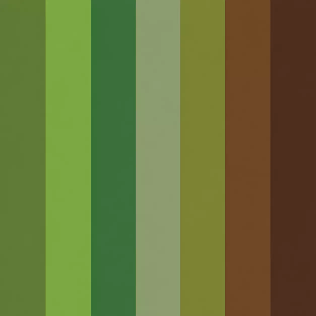
Forest Walk
A calm, earthy palette inspired by leaves, moss, tree bark, and quiet paths where Biscuit can sniff absolutely everything with great professional seriousness.
Forest Walk combines fresh greens, soft natural tones, and warm woodland browns. It is a steady, grounded palette that works beautifully for nature-inspired artwork and peaceful mandalas.
Best for
Nature scenes, woodland artwork, leafy mandalas, outdoor sketches, animals, trees, plants, and calm earthy designs.
Colours Included
Moss green, leaf green, fern green, sage green, olive green, bark brown, and woodland brown.
Why It Works
Forest Walk uses colours that feel close to nature. The greens create freshness and life, while the browns add warmth and stability. Together they make a palette that feels balanced, calm, and quietly adventurous.
Your Turn
Recreate this palette in the grid, then keep your finished page as a colour reference.
Autumn Glow
A warm, cosy palette inspired by falling leaves, crisp mornings, and the sort of woodland walk that somehow ends with Biscuit covered in mud and looking extremely pleased about it.
Autumn Glow combines rich reds, golden yellows, warm oranges, and earthy browns. It is a welcoming palette full of warmth, colour, and seasonal charm.
Best for
Autumn artwork, cosy scenes, woodland projects, seasonal mandalas, harvest themes, and warm decorative designs.
Colours Included
Golden yellow, amber, pumpkin orange, burnt orange, deep red, chestnut brown, and dark brown.
Why It Works
Autumn Glow uses colours that sit close together in the warm part of the colour wheel. Because the colours are closely related, they feel harmonious and comfortable while still creating plenty of contrast and interest.
Your Turn
Recreate this palette in the grid, then keep your finished page as a colour reference.
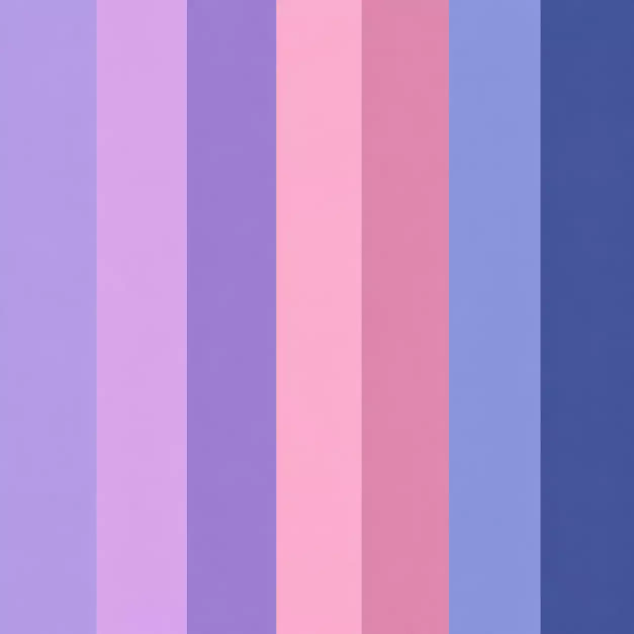
Lavender Dreams
A gentle, dreamy palette inspired by lavender fields, twilight skies, and the sort of peaceful afternoon that makes Biscuit fall asleep halfway through guarding something important.
Lavender Dreams combines soft purples, delicate pinks, and cool blues. It is a calm and imaginative palette that feels magical without becoming too bright or overwhelming.
Best for
Fantasy artwork, floral designs, peaceful mandalas, evening scenes, magical illustrations, and gentle decorative patterns.
Colours Included
Lavender, lilac, soft violet, pastel pink, dusty rose, periwinkle blue, and twilight blue.
Why It Works
Lavender Dreams uses colours that are close together in the cool part of the colour wheel. The purples, pinks, and blues blend naturally, creating a palette that feels peaceful, imaginative, and wonderfully calm.
Your Turn
Recreate this palette in the grid, then keep your finished page as a colour reference.
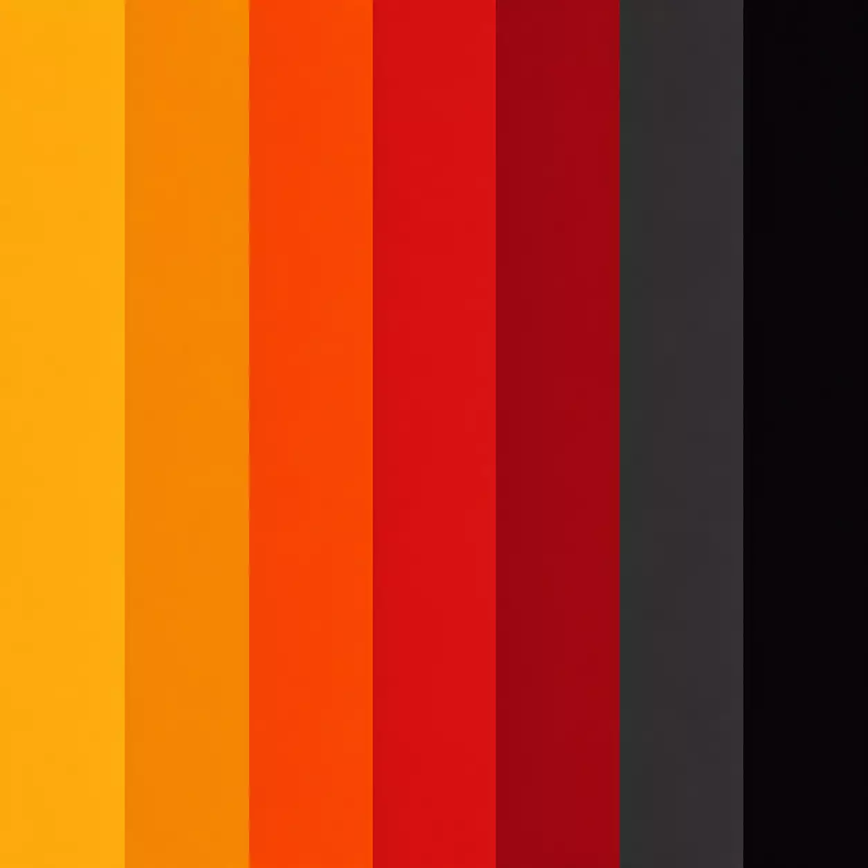
Dragon Fire
A bold, energetic palette inspired by dragons, glowing embers, treasure hoards, and the sort of adventure that usually begins with someone saying, “This is probably a bad idea.”
Dragon Fire combines fiery reds, glowing oranges, rich golds, and deep shadow tones. It is a dramatic palette that feels powerful, adventurous, and full of excitement.
Best for
Fantasy artwork, dragons, heroes, treasure maps, action scenes, dramatic mandalas, and bold decorative designs.
Colours Included
Bright gold, amber, flame orange, scarlet red, crimson red, charcoal grey, and deep black.
Why It Works
Dragon Fire combines warm colours that naturally suggest heat, energy, and movement. The dark greys and blacks create strong contrast, making the brighter colours appear even more powerful and dramatic.
Your Turn
Recreate this palette in the grid, then keep your finished page as a colour reference.
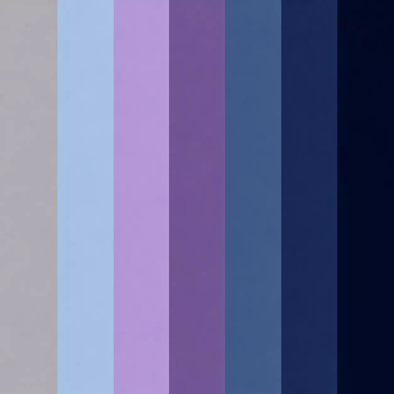
Moonlight Garden
A quiet, mysterious palette inspired by moonlit flowers, silver leaves, and the sort of evening when the garden suddenly feels much more magical than it did five minutes ago.
Moonlight Garden combines cool blues, soft silvers, gentle purples, and deep midnight tones. It is a peaceful palette that feels calm, elegant, and a little mysterious.
Best for
Night scenes, moonlit landscapes, fantasy artwork, elegant mandalas, flowers, stars, and peaceful decorative designs.
Colours Included
Silver grey, moonlight blue, soft lavender, twilight purple, dusty blue, midnight blue, and deep navy.
Why It Works
Moonlight Garden uses cool colours with only gentle contrast between them. This creates a smooth, restful palette that feels peaceful and atmospheric, much like a garden illuminated by moonlight.
Your Turn
Recreate this palette in the grid, then keep your finished page as a colour reference.
Tropical Splash
A bright, energetic palette inspired by tropical flowers, colourful birds, crystal-clear water, and the sort of holiday Biscuit would immediately spend chasing crabs.
Tropical Splash combines vibrant blues, lively greens, sunny yellows, and bold pinks. It is a playful palette that feels colourful, adventurous, and full of energy.
Best for
Tropical artwork, colourful animals, summer scenes, bright mandalas, beach projects, and bold decorative designs.
Colours Included
Turquoise, aqua blue, palm green, sunshine yellow, coral orange, tropical pink, and deep teal.
Why It Works
Tropical Splash combines both warm and cool colours, creating strong contrast and lots of visual excitement. The bright colours feel lively and energetic, while the blues and greens help keep the palette balanced.
Your Turn
Recreate this palette in the grid, then keep your finished page as a colour reference.
Rainbow Journey
A bright, adventurous palette inspired by rainbows, imagination, and the sort of journey where nobody is entirely sure where they are going but everyone agrees it will probably be interesting.
Rainbow Journey combines colours from across the spectrum, creating a cheerful palette full of energy, variety, and creativity. It is the most colourful palette in the collection and encourages bold, playful experimentation.
Best for
Creative experiments, fantasy artwork, celebrations, colourful mandalas, imaginative projects, and anything that needs a little extra excitement.
Colours Included
Red, orange, yellow, green, blue, indigo, and violet.
Why It Works
Rainbow Journey includes colours from across the entire colour wheel. Because it contains both warm and cool colours, it offers endless possibilities for contrast, harmony, and creative exploration.
Your Turn
Recreate this palette in the grid, then keep your finished page as a colour reference.